Archive for May, 2011

Monochromatic is Dramatic.

Monday, May 30th, 2011

“Monochromatic color schemes are derived from a single base hue, and extended using its shades, tones and tints (that is, a hue modified by the addition of black, gray (black + white) and white. As a result, the energy is more subtle and peaceful due to a lack of contrast of hue. Monochromatic color schemes may be considered boring unless there is diversity within the design.” – Wikipedia
Wikipedia is right – Monochromatic rooms can be boring.  If I say, “grey room,” you might think, “That sounds really dreary.”  But, if the grey color scheme is implemented correctly, like the room below, the result is stunning!  Check out this room, as well as some other basically single colored rooms that I have included for good measure.  Enjoy!

[Grey+bedroom+Emmadinverno_co_uk+2.jpg]


Not Your Grandmother’s Bath…

Friday, May 27th, 2011

Many people think of free-standing baths (traditionally claw-foot) as outdated.  Recently, the free-standing bath has been revived into something fresh and new.  By treating the bathtub as a piece of furniture, you can create a very sophisticated and inviting look.  And, let’s face it, free-standing baths not only look amazing, but they have a certain romance about them.  Even taking a traditional claw-foot tub (like the one pictured below) and painting the outside black, or any color for that matter, can bring it up to date.  If you are building a home in or around Austin, or thinking about re-modeling your master bath, consider a free-standing bathtub.  We would be glad to help you find a resource!

Aidan Gray…More Chic Than Shabby.

Wednesday, May 25th, 2011

Look at some of our finds by Aidan Gray Home (www.aidangrayhome.com).  The entire product line is inspired by “European Grandeur,” and focuses on an authentic, hand-made look.  While this is a relatively young company, Aidan Gray Home has taken on the interior design and decor industry by storm…and they seem to have what it takes to have staying power.  They have a very specific look that has wide appeal, especially for transitional interiors.  If you are interested in these or any of the products from Aidan Gray Home, just let us know!

A Marriage Made in Italy…

Monday, May 23rd, 2011

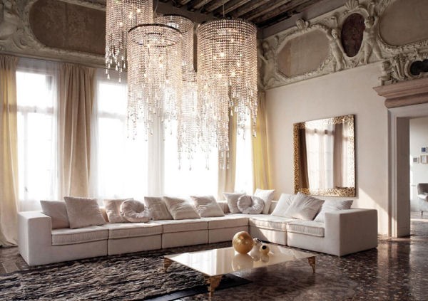
It can be so exciting to take a historical place, filled with opulent wood carvings and history, and fill it with simple, clean-lined furniture.  This apartment in Italy is brimming with whispers of a grand past…and at the same time, screaming of a very current present.  We love that the bones of this amazing structure have been left seemingly untouched, only updated with a gorgeous and modern  grouping of ethereal chandeliers.  The interior designer who selected the furniture for this home did a great job of keeping it simple.  In doing so, they have allowed us to really take in the beauty of marrying current furnishings to a centuries old space.

cattelan-italia-gorgeous-living-rooms-ideas-decor-3.jpg

So Chic Shagreen…

Friday, May 20th, 2011


Shagreen is derived from untanned skin of animals, commonly sharks and sting rays, that are covered in close-set tubercles (and commonly died green).  Today, you can find plenty of beautifully made furniture and accessories from both real, and very often faux, shagreen.  One great thing about shagreen is its versatility.  It can look very masculine when made dark, or appears very feminine in lighter shades.  If you are interested in locating some shagreen products, let us know…we will be happy to find the right ones for your home.

The Butler’s Pantry – Made Relavent, Again.

Wednesday, May 18th, 2011

Traditionally, butler’s pantries have been small spaces, adjacent to the dining room, that house fine china.  They may have a small sink, but don’t get much use.  These days, people (even those who have extravagant homes) typically don’t want rooms that they won’t utilize.  We are living more efficiently today.  Below you will find some examples of butler’s pantries that have been made into prep kitchens.  Imagine throwing a party and being able to conceal the mess into a single room that is accessed through the kitchen, but not in it.  While a prep kitchen is not in every one’s budget, it is certainly a luxury worth dreaming about!

Inspired By Nature.

Monday, May 16th, 2011


Palecek furniture is very distinctive.  Their entire product line seems to marry nature and interior design.  Here is what they say about their products:

“More than 35 years ago, Palecek began designing distinctive rattan and wicker items with one goal in mind –  to create unique pieces of art from natural fibers. As we traveled the world developing a network of master artisans, we drew inspiration from the indigenous peoples and their use of quickly renewable materials. Our desire to mix an international palette of natural fibers into elegant furniture, lighting and accessories has made Palecek a trendsetter and pioneer in the use of fast-growing hardwoods, seagrass and rattan weaves.   Our extensive line of award winning, handcrafted and eco-conscious designs are conceived in our domestic San Francisco Bay Area headquarters.  It is here that our master technicians upholster and finish your pieces, allowing Palecek to be your domestic design resource.”

“To the Trade”

For more, visit www.palecek.com

Moraccan Inspired Home Decor..

Friday, May 13th, 2011


For those of you who prefer the eclectic for your Austin home, look no further than Wunderley Furniture.  Their imported products are hand-crafted and are beautiful, and their product line includes everything from furniture to lighting and accessories.  A quick tip, though – these pieces would be a great addition to any interior…but be careful not to overdo it.  A single inlaid table, bench, or mirror can add interest and “pop,” but too much of a good thing will just create a theme, which can make the overall design seem trite. 

SB71-36" Mosaic Cocktail table


SB502-Mother of Pearl Inlaid Bench

MB301-Old Kilim cube

ML44-Long Leather Wall Sconce

Vintage Shell Inlay Mirror-212

For more from Wunderley, visit www.wunderley.com , or contact Colby Design…we’d be glad to help!

Traditional Inspiration…Dreamlike State.

Wednesday, May 11th, 2011


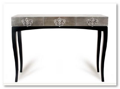
The artwork that is Boco do Lobo’s furniture is astounding.  The designers manage take the onlooker on a visual and emotional  journey, as they take traditional forms and craft them into something more.  Sometimes when we dream, we warp things in our minds, just a little, but the forms in the dream still make sense.  This idea seems to be threaded through Boco do Lobo’s designs.  The take classic forms and present them in whimsical ways that inspire the onlooker, just as art stirs each of us differently. 

For more, visit www.bocodolobo.com 

Asymmetry…

Monday, May 9th, 2011


Asymmetry is a great way to add interest to any room.  The key is for the eye to really see that the space is kind of out of balance (but in a good way).  The living room below is a great example of how to work in some asymmetry.  What makes this work is the fact that the mantel runs the full length of the fireplace wall.  It is the balancing factor, and it pulls the eye to the fireplace (which isn’t very large…but you probably didn’t notice that part).  Instead, the eye focuses on the wall, in its entirety, which looks grand.