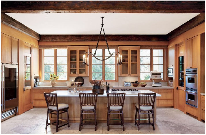
The kitchen is one of the most important rooms in the house. It is one of the first places we go when we wake in the morning, and probably the last place we go before retiring for the night. Shouldn’t the place where we start and end our day be beautiful? We, at Colby Design, say “Yes.” The kitchen pictured below is stunning. It is light and airy – very inviting for the whole family. The symmetry is just beautiful!
Archive for June, 2011
Cooking In Style.
Wednesday, June 29th, 2011Posh Pets…
Tuesday, June 28th, 2011We in Austin are very pet friendly, and we love our pets, but pet beds for the home can be unsightly…until now. Here are some great pet beds by some designers that will leave your home stylish and your pet happy!


Urban Pet House

“The Cool Dog” Bed

Outdoor by Firelight…
Wednesday, June 22nd, 2011Is there such a thing more romantic than firelight or candles? Fireplaces are an amazing design feature that can add such drama to your outdoor living spaces. They are cozy and invite us to simply relax in their presence. Look at some of the inspiring ways that we found to introduce fireplaces into your home.


Another Quick Note On Assymetry…
Wednesday, June 22nd, 2011We’ve talked about how assymetry works well in rooms when implemented in the architecture, but check out some of these assymetrical rugs. They are interesting, without being over the top, and they carry a traditional thread, but with a twist. Traditionally, rugs have been repeating patterns, that over the years, have grown in scale. For those of you non-conformists, it is now easy to find a rug that is a deviation from the expected.


If you are interested in any of the above rugs, they are available “To the Trade” and we’d be happy to help with your interior design needs.
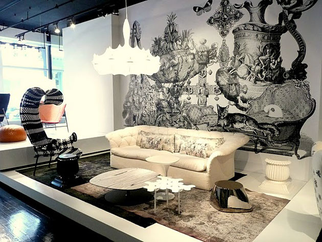
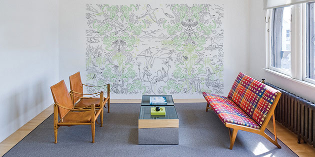
Maraham Digital Projects
Monday, June 20th, 2011Maraham is a company that has created large scale digital images that can be mounted on the wall of your home or office. They have an enormous virtual library, with new designs being created constantly. Check out some of these interesting finds below. For more, visit http://www.maharam.com


A True Modern Haven.
Thursday, June 16th, 2011Designer Steve Hermann has created something that seems to defy the laws of physics in this modern home in Montecito, California. Most of the home’s walls are glass, and both the flooring and the semi-freestanding wall, clad in book-matched marble, seem to flow effortlessly from the indoors out. Along the same lines, the outdoors pour into the floor to ceiling windows, creating natural and living art everywhere you look. This breath-taking home is art first, then a residence.


This lower level leads to the indoor garage.


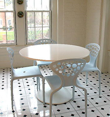
The Tulip Table…Truly Timeless.
Monday, June 13th, 2011Eero Saarinen’s Tulip Table was first introduced close to 70 years ago, and it has managed to remain perfectly relevant today. This is because this timeless beauty is perfect for almost any decor. It has been copied by countless manufacturers, making it an affordable option to the masses. When the Tulip Table was born, it had a powder coated steel base with options for its top: laminate, wood, or marble, and could be round or oval. Today, it is commonly replicated with a fiberglass base, but the table top options still seem to be available. Take a look at Saarinen’s creation, and imagine how beautiful it would be in your Austin home!



A Gorgeous Dining Room In Texas.
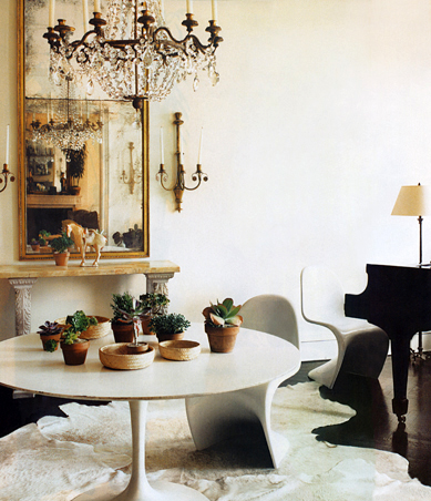
Friday, June 10th, 2011Dining rooms don’t get enough use today. Often, they are reserved for formal occasions because they, themselves, seem too formal for our everyday lives. The dining room below is an exception. While it is formal, it is not stuffy. The rustic architecture makes it feel more approachable and livable. The interior design is both clean and simple, without being stark. So, when you are considering how you might want to fill your dining space, think about how you live. It is possible to create a space that is sophisticated and useful for everyday living.
Home Offices With Snap.
Wednesday, June 8th, 2011People are spending more and more time in front of the computer as our society becomes more and more technology reliant. Because of this, we want our home offices to be both aesthetically pleasing and inviting. The study below has these qualities…and we love it. It has that great mix of transitional style in a traditional setting, and is large enough for a sitting area by the fire. The large windows and and ample lighting make this room bright, even though the walls are dark.

Understated & Luxurious…
Monday, June 6th, 2011
Now here is a luxurious, but somehow understated master bath worth taking a look at. What is so fantastic about this interior is the way that the traditional elements, such as the stone mosaic floor, are juxtaposed with the contemporary frame-less windows and clean lines on the walls. The bath itself is gorgeous and its simple lines, carved from stone, compliment the overall design scheme beautifully.


