Gray tones produce a feeling of coolness, especially when incorporated via marble or tile. The guest bath pictured below is a prime example. The gray marble, combined with the blue counter top and the mirrored vanity cabinet is refreshing. We like that the theme is carried from the bedroom, as is seen in the mirror’s reflection of the blue drapes hanging there. Another nice thing about this bath is that is that while it is cool, it is not cold. If you would like to get this look, let Colby Interior Design get you there!
Archive for the ‘Architecture’ Category
A “Cool” Feeling Bath…
Monday, January 9th, 2012Banquettes: Cozy Spots That Add Charm.
Monday, December 5th, 2011
Banquettes are great. They are space savers, for those homes with limited room to dine, or for those who are simply wanting to add a cozy corner to their large space. What we love about them is the charming atmosphere that they create. Their is a certain intimacy about dining in a small comfortable spot that is lost on a large dining table. Below are some great little banquettes that add that touch of charm and warmth.


Historic & Haunted? Austin’s Driskill Hotel.
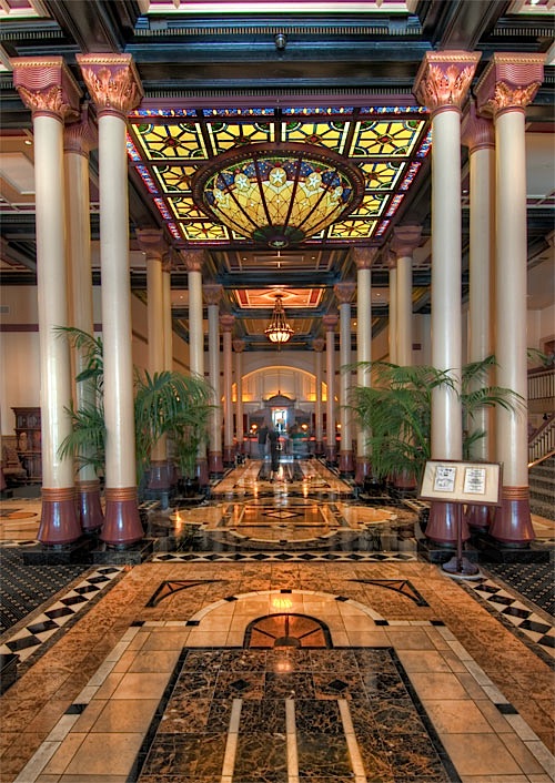
Monday, October 31st, 2011Happy Halloween, people of Austin! In celebration of this spooky occasion, we at Colby Design would like to call your attention to an Austin landmark – The Driskill Hotel. The hotel opened on December 20, 1886, and was built by cattle baron Col. Jesse L. Driskill. It is still considered one of the premier hotels in central Texas, with lavish amenities.
One year after opening, though, the daughter of a Texas senator took a fatal tumble down the grand staircase while chasing a bouncing ball, and legend has it that she can be heard bouncing that ball in the lobby and along the mezzanine. Another haunted tale of the Driskill centers around room 525, where two young brides, 20 years apart, took their own lives in the same bathroom at the hotel…
Whether you are looking for a spooky place to venture out, or just a great historic architectural spot, check out the Driskill, and have a happy Halloween!


Luxurious & Glamorous.
Monday, October 24th, 2011
Now here is a master bath that is simply luxurious. This design combines the old with the new. The classic marble selection is Emperador, joined with the sleekness of mirrors, floor to ceiling glass, and a cantilievered vanity, keep this bathroom modern, but classic, too. It’s clean lines are softened by the sheer drapes and the gorgeous view, and its warm neutral palette gives this master bath an understated elegance.
AIA Homes Tour…October 1-2, 2011
Monday, September 26th, 2011Don’t miss the American Institute of Architects’ Home Tour of the Bowman Residence this Saturday and Sunday. The featured home is by Cornerstone Group Architects. Here is what they have to say about the Bowman Residence:
“The driving impetus for this Tarrytown residence was centered around creating a green and sustainable home. The owner-Architect collaboration was unique for this project in that the client was also the builder with a keen desire to incorporate LEED-centric principles to the design process. The original home on the lot was deconstructed piece by piece, with 95% of the materials either reused or reclaimed. The home is designed around the existing trees with the challenge of expanding the views, yet creating privacy from the street. The plan pivots around a central open living core that opens to the more private south corner of the lot. The glazing is maximized but restrained to control heat gain. The residence incorporates numerous features like a 5,000-gallon rainwater collection system, shading features, energy-efficient systems, spray-foam insulation and a material palette that helped the project achieve a five-star rating with the Austin Energy Green Building program.” -AIA website.


Cooking In Style.
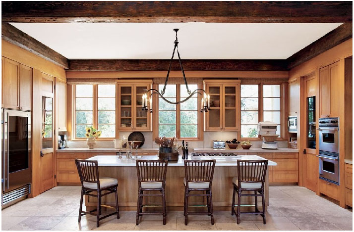
Wednesday, June 29th, 2011The kitchen is one of the most important rooms in the house. It is one of the first places we go when we wake in the morning, and probably the last place we go before retiring for the night. Shouldn’t the place where we start and end our day be beautiful? We, at Colby Design, say “Yes.” The kitchen pictured below is stunning. It is light and airy – very inviting for the whole family. The symmetry is just beautiful!
A True Modern Haven.
Thursday, June 16th, 2011Designer Steve Hermann has created something that seems to defy the laws of physics in this modern home in Montecito, California. Most of the home’s walls are glass, and both the flooring and the semi-freestanding wall, clad in book-matched marble, seem to flow effortlessly from the indoors out. Along the same lines, the outdoors pour into the floor to ceiling windows, creating natural and living art everywhere you look. This breath-taking home is art first, then a residence.


This lower level leads to the indoor garage.


A Gorgeous Dining Room In Texas.
Friday, June 10th, 2011Dining rooms don’t get enough use today. Often, they are reserved for formal occasions because they, themselves, seem too formal for our everyday lives. The dining room below is an exception. While it is formal, it is not stuffy. The rustic architecture makes it feel more approachable and livable. The interior design is both clean and simple, without being stark. So, when you are considering how you might want to fill your dining space, think about how you live. It is possible to create a space that is sophisticated and useful for everyday living.
Understated & Luxurious…
Monday, June 6th, 2011
Now here is a luxurious, but somehow understated master bath worth taking a look at. What is so fantastic about this interior is the way that the traditional elements, such as the stone mosaic floor, are juxtaposed with the contemporary frame-less windows and clean lines on the walls. The bath itself is gorgeous and its simple lines, carved from stone, compliment the overall design scheme beautifully.
Not Your Grandmother’s Bath…
Friday, May 27th, 2011Many people think of free-standing baths (traditionally claw-foot) as outdated. Recently, the free-standing bath has been revived into something fresh and new. By treating the bathtub as a piece of furniture, you can create a very sophisticated and inviting look. And, let’s face it, free-standing baths not only look amazing, but they have a certain romance about them. Even taking a traditional claw-foot tub (like the one pictured below) and painting the outside black, or any color for that matter, can bring it up to date. If you are building a home in or around Austin, or thinking about re-modeling your master bath, consider a free-standing bathtub. We would be glad to help you find a resource!


