Archive for the ‘Rooms We Love’ Category

‘Tis The Season…

Monday, December 12th, 2011

The Christmas Season is upon us!  We at Colby Design just love the holiday season…it is a whole new reason to create a different look in your home, which is something that every designer loves.  Because you are probably about to (or already have) pulled the decorations out, we want to pass along a holiday decor tip.  Decorate your tree and your space in colors that reflect your room’s color scheme.  That simple concept will transform the whole room (instead of just the corner where your tree is), into something that looks sophisticated and carries a common thread throughout the space.  Below are some examples. Enjoy!

Luxurious & Glamorous.

Monday, October 24th, 2011

Now here is a master bath that is simply luxurious. This design combines the old with the new. The classic marble selection is Emperador, joined with the sleekness of mirrors, floor to ceiling glass, and a cantilievered  vanity, keep this bathroom modern, but classic, too.  It’s clean lines are softened by the sheer drapes and the gorgeous view, and its warm neutral palette gives this master bath an understated elegance.

A Peach Colored Room…Vibrant And Soothing.

Wednesday, September 7th, 2011

Peach is a color that most people are very opinionated about…they either love it or they hate it.  I think that the room below could potentially blur the line between the two camps.  The idea of painting a peach room in your home might actually frighten some of you, and you might dismiss it as “not an option.”  While this color is traditionally a feminine one, the use of clean lines and the introduction of a more rustic decor serve to create a masculine sensibility about the otherwise effeminate color.

Innermost House.

Wednesday, July 13th, 2011

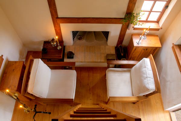
Can you imagine living in a 12 x 12 home?  Most of us think it is laughable (the idea may even make you squirm in your seat), but for Dianna and Michael Lorence, it is heaven on earth.  No electricity or running water…just the sunlight that nature has bestowed upon us and firelight in this home.  Although this beautifully simple life is not for everyone, I would hope that you could agree with us on how serene the nature of this home really is.

Cooking In Style.

Wednesday, June 29th, 2011

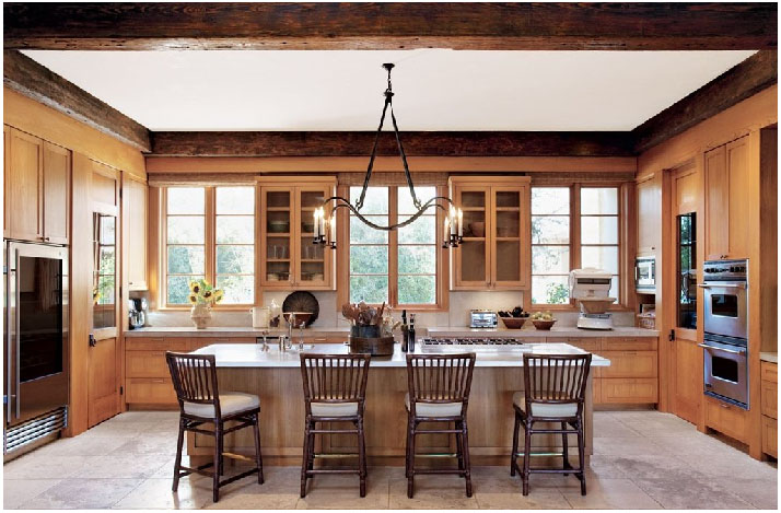
The kitchen is one of the most important rooms in the house.  It is one of the first places we go when we wake in the morning, and probably the last place we go before retiring for the night.  Shouldn’t the place where we start and end our day be beautiful?  We, at Colby Design, say “Yes.”  The kitchen pictured below is stunning.  It is light and airy – very inviting for the whole family.  The symmetry is just beautiful!

A True Modern Haven.

Thursday, June 16th, 2011

Designer Steve Hermann has created something that seems to defy the laws of physics in this modern home in Montecito, California.  Most of the home’s walls are glass, and both the flooring and the semi-freestanding wall, clad in book-matched marble, seem to flow effortlessly from the indoors out.  Along the same lines, the outdoors pour into the floor to ceiling windows, creating natural and living art everywhere you look.  This breath-taking home is art first, then a residence.

This lower level leads to the indoor garage.


A Gorgeous Dining Room In Texas.

Friday, June 10th, 2011

Dining rooms don’t get enough use today.  Often, they are reserved for formal occasions because they, themselves, seem too formal for our everyday lives.  The dining room below is an exception.  While it is formal, it is not stuffy.  The rustic architecture makes it feel more approachable and livable.  The interior design is both clean and simple, without being stark.  So, when you are considering how you might want to fill your dining space, think about how you live.  It is possible to create a space that is sophisticated and useful for everyday living.

Home Offices With Snap.

Wednesday, June 8th, 2011

People are spending more and more time in front of the computer as our society becomes more and more technology reliant.  Because of this, we want our home offices to be both aesthetically pleasing and inviting.  The study below has these qualities…and we love it.  It has that great mix of transitional style in a traditional setting, and is large enough for a sitting area by the fire.  The large windows and and ample lighting make this room bright, even though the walls are dark.


Understated & Luxurious…

Monday, June 6th, 2011

Now here is a luxurious, but somehow understated master bath worth taking a look at.  What is so fantastic about this interior is the way that the traditional elements, such as the stone mosaic floor, are juxtaposed with the contemporary frame-less windows and clean lines on the walls. The bath itself is gorgeous and its simple lines, carved from stone, compliment the overall design scheme beautifully.

?

Monochromatic is Dramatic.

Monday, May 30th, 2011

“Monochromatic color schemes are derived from a single base hue, and extended using its shades, tones and tints (that is, a hue modified by the addition of black, gray (black + white) and white. As a result, the energy is more subtle and peaceful due to a lack of contrast of hue. Monochromatic color schemes may be considered boring unless there is diversity within the design.” – Wikipedia

Wikipedia is right – Monochromatic rooms can be boring.  If I say, “grey room,” you might think, “That sounds really dreary.”  But, if the grey color scheme is implemented correctly, like the room below, the result is stunning!  Check out this room, as well as some other basically single colored rooms that I have included for good measure.  Enjoy!

[Grey+bedroom+Emmadinverno_co_uk+2.jpg]